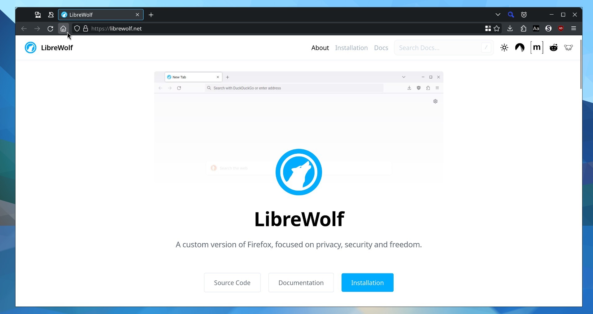
A little admiration of how easy UI customization is on Firefox, and how shitty Chromium looks.
Try these settings on Firefox in about:config
gfx.font_rendering.cleartype_params.enhanced_contrast = 100
gfx.font_rendering.cleartype_params.pixel_structure = 5
gfx.font_rendering.cleartype_params.rendering_mode = 5
gfx.font_rendering.fallback.always_use_cmaps = trueI cannot use Firefox without them. They adjust the text rendering to be more… normal, I don’t understand why they aren’t default, but maybe things change at higher resolutions (but I don’t own a 2160p monitor to test).
Cleartype is not there on my Fedora Firefox on KDE?
Sooo you mean “Windows has horrible font rendering” ;D I think on KDE its fine, some say GNOME is better but idk.
Strange, I always find it extremely ugly when using Win10 and I think Win11 has improved a lot but not entirely. Its so square-ish for some reason
No offence, but I used to think Windows had good font rendering while I was using it. That was until I started using Linux distros. Now every time I boot into Windows, I again remember how awful Windows looks in comparison - washed out, pixelated, gives me eye strain…
I have the inverse - where Windows is so fine and pixelated it looks blurry. Linux is sharp and legible. It may be to do with with sub-pixel rendering. And this has been the case for across multiple computers and laptops, windows versions and Linux distros.
never in my years of using Linux have I ever thought that it was rendered clearer. let’s be honest with ourselves, no need to lie.
It’s a function of PPI, hinting settings, font face, etc. The both of you can be correct in your own right…
Objectively there is a long history font rendering issues under linux though, so… eh.
There’s no need to lie when I can tell the truth lol.
That’s interesting… it makes a difference indeed.


