Hey everyone.]
So update 98/99 has gone live which fixes the crashes (thanks for the reports).
I’m gearing up for a pretty sizable release but just wanted to check in and ask if there was any issues you’re having that I should know about or any new feature requests.
Sorry for the bad comms but I’m making my way through lots of messages and posts on here. Thanks for the patience as I get through these all.
Cheers, Lj
Multiple images in comments have been pretty buggy, I’ll tap one and it goes to the other image
Do you have an example?
It mostly seems to have issues on the side of images, but some just can’t be tapped on.

Edit: from here though it happens most times there are multiple images displayed together.
edit 2: on s22 ultra if that helps!
I’m partly colorblind and it’s super hard for me to see when I upvoted or downvoted a post. Just making the up or down arrow bolder (or circled) once it’s been clicked would fix the issue completely for me and all types of colorblind people.
Thank you for the great work 💛
Which view type are you using?
I’m not sure where to find which one I’m using. I use dark mode and the colors I’m having trouble with if the font is too thin or small are the orange and light blue. Changing the font weight or adding another style would also mean this is visible in night mode on Android (which removes all colors)
Edit : I investigated the viewtypes and they all have the same issue of using the same font size and weight, just using the orange/blue color for the number of upvotes and the selected arrow.
Edit 2 : increasing brightness helps a lot with the colors, but I’m mostly using Sync at night on minimum brightness.
The best way for you to visualize the issue would be to activate black and white night mode on Android :)
Thanks for the update.
Would allowing setting a custom color help?
Not sure how I would use that. Do you mean 2 custom colors to change both the default orange and blue? I can perfectly distinguish them when they’re on a bolder shape (🟠🔵), it’s just a lot harder (or sometimes impossible) on a thin line/symbol.
Again, the most efficient way to handle it would be to have a different style for the selected arrow (bolder, bigger, underlined or circled for example), on top of its color. It would then work as well in bedtime mode (b/w and low brightness) for everyone, not just for color blind people :)
I think bedtime mode activates by default on newer Android devices after 10pm when the phone is charging. That’s how mine (OnePlus) was set up.
I see my initial reply was upvoted about 30 times. Statistically speaking, I don’t think these would be only from color blind people
Added support for the next release to change the colors.
Can i ask if you meant to put a yellow heart or did you thought you were putting a red one ?
Yellow is actually quite normally visible for most colorblind people. Blue is as well, interestingly.
The most typical type of colorblindness involves inability to distinguish between red and green.
It’s blue, you plonker
You too ? Or is it me ?
Yellow is very visible, it was intentional but with no specific purpose :) There are multiple types of color blindness but all of them will be aggravated if a font or shape is thin or just outlined (which is not the case with a filled in heart emoji)
Is there a particular significance of a yellow one?
Edit: oh dammit I just got it.
Any chance of an option to flip the upvote/downvote colors to the Lemmy ordering (blue up/red down)? It’s always a little jarring going between the app and website and seeing all my votes are backwards
A new spammer today made me think of another feature request: automatically refresh the currently viewed comment section after blocking a user to instantly remove the blocked comments.
I have a feature request. Harmonic for hackernews has the option to open a url directly on archive.org, which I think is a pretty neat feature. Would it be possible to add this?
How would that work exactly?
Like this link https://google.com would open https://archive.org/details/google.com ?
You can use the wayback machine api to retrieve the latest snapshot of a particular url, which is useful to evade paywalls.
Perfect. I’ll add support.
I just tested with a random link and it’s exactly that.
I’m hoping the new update will include the new “scaled” sorting option. I think it will really help support smaller communities on Lemmy if more people use it.
My app still crashes if I try to view my messages inbox :(
Everytime? Not seeing this coming through
There’s a thing where if you go to the inbox from the left drawer, and change your … page? View? From, for example, Unread Replies to Mentions, or whatever, and it crashes every time. Also the More Actions inbox is like that.
Edit: just tried again - left drawer inbox, go from All Replies to Unread Replies, crash.
Edit 2: found the GitHub issue about it: Issue 446 if anyone else wants to add info to it.
I recently started using a VPN and have found that I can’t post comments while my connection is secured. Don’t know if that’s a Sync issue or what.
It would be nice to have a quick action to change thumbnails to the opposite side.
Which?
Just opposite of the current position. Would only apply to views where thumbnails can be on one side of course (small, smaller, compact)
The biggest thing I’d wish for is full markdown support, stuff like spoiler tags, superscript and tables is still not working properly and it would be nice if it did.
I also don’t know if this is a bug others experience or if I have messed something up on my device, but clicking community links sometimes opens up the link in browser instead of in Sync.
Finally, highlighting new comments on a thread re-visit would be a dream, but last I heard it wasn’t supported by the backend. But maybe an option to highlight comments made during the last X minutes as a sort of hack?
Noted, I think its probably time to completely replace the old markdown processor.
As for tables, how are they not working right?
Do you have an example of a link that opens the browser?
I think there were issues if tables got too wide IIRC. Tables are a bit of a nightmare to deal with though. I would also personally prefer to not hide the borders for better readability, but I guess that’s more of a preference and less of an issue.
For links, I have not been able to deduce a pattern. I usually test with the posts at !trendingcommunities@feddit.nl For a while I thought it was related to certain instances, but in today’s post one of the links going to lemmy.ca opened in browser and another in Sync. Very puzzling.
Full immersive mode, or transparent navigation bar. Gesture navigation is horrible.
Is that different from Settings shortcut: General > Transparent status immersive setting and Settings shortcut: General > Autohide bottom navigation auto hide the nav bar?
That setting is for the in app navigation bar, not the android navigation bar. I am referring to this:
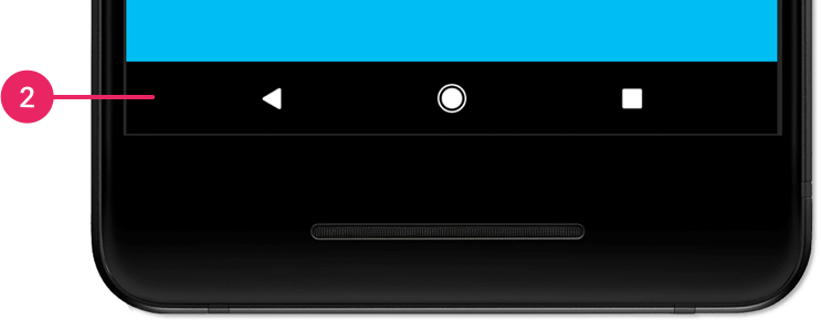
Ah! Ok, I was misunderstanding - thanks for correcting me. That’s one that I can’t help with! It seems like a problem I would try something like an “auto-hide” feature for on my phone, and probably just give up on if it wasn’t there. I’m not good at tech support.
¯\_(ツ)_/¯ 😸Android 10 and below used to have a system wide full immersive mode where you could hide the navigation bar and status bar. They removed the feature in android 11. Samsung phones still support it, but if you use stock or close to stock android, you’re out of luck.
Ah, so maybe that’s what I was thinking of with my “search my phone settings” approach…
¯\_(ツ)_/¯It would be nice in the immersive interface situation, as you had mentioned in the first place! Thanks a lot, now I want that feature!
:-P
I’d still like to see OpenBoard keyboard get to auto-complete/correct in the title field (and Swiftkey, I’ve heard). I don’t know what’s up with that, but it makes me sad.
The spoiler tags could use an overhaul so they are consistent with the rest of Lemmy. (Obviously handled in the markdown overhaul you mentioned)
Being able to edit image posts, or the titles of posts in the app would be appreciated.
The other thing that’s on my list is the inbox thing. There’s the discrepancy in badges for unread - bottom nav bar gets the badge, but the other views don’t seem to; there’s also the crashing when I change to other views in my inbox if I get there from the left drawer or the top “More Actions” area. (Pretty sure I made issue tracker reports on those.)
Welcome back, LJ! Thanks for all the work you put into Sync - it is such a good interface and user experience overall, and I love it.
(シ_ _)シThank you for making this app 💜💜💜
I’ll add another feature request that I forgot: instance browsing. Being able to see a list of communities within a remote instance would be nice (preferably sorted by subscribers like in the web UI). Being able to see the Local feed from a selected remote instance would also be useful. I think both those features could help with community discovery.
EDIT: disregard most of this, I was blind to the instances button. It would still be nice to see the communities-list on an instance sorted by size.
Is that different than using the “instance” button to go to (for example) lemmy.world and then the “communities” button to bring up this list:
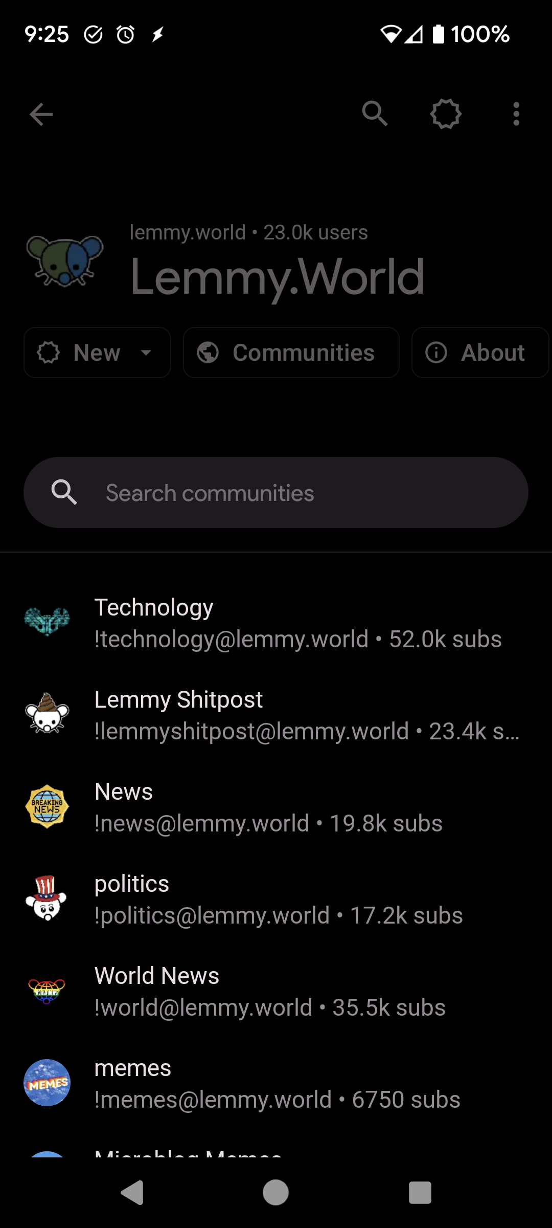
(Edit: I see that my pic isn’t all sorted by size, and that’s a difference, but I’m genuinely curious about other ways to browse other instances since I’m basically alone on mine)
EDIT: I was apparently blind to the instances button dear lord.
Being able to see communities on an instance sorted by size like the web UI would be nice, though, still.
Right on top of your feed.
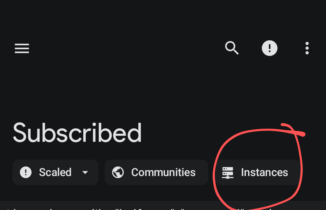
Find it? (New comments aren’t highlited yet, so I didn’t notice this)
There’s also one in my More Actions menu (the 3 dots in the upper right)
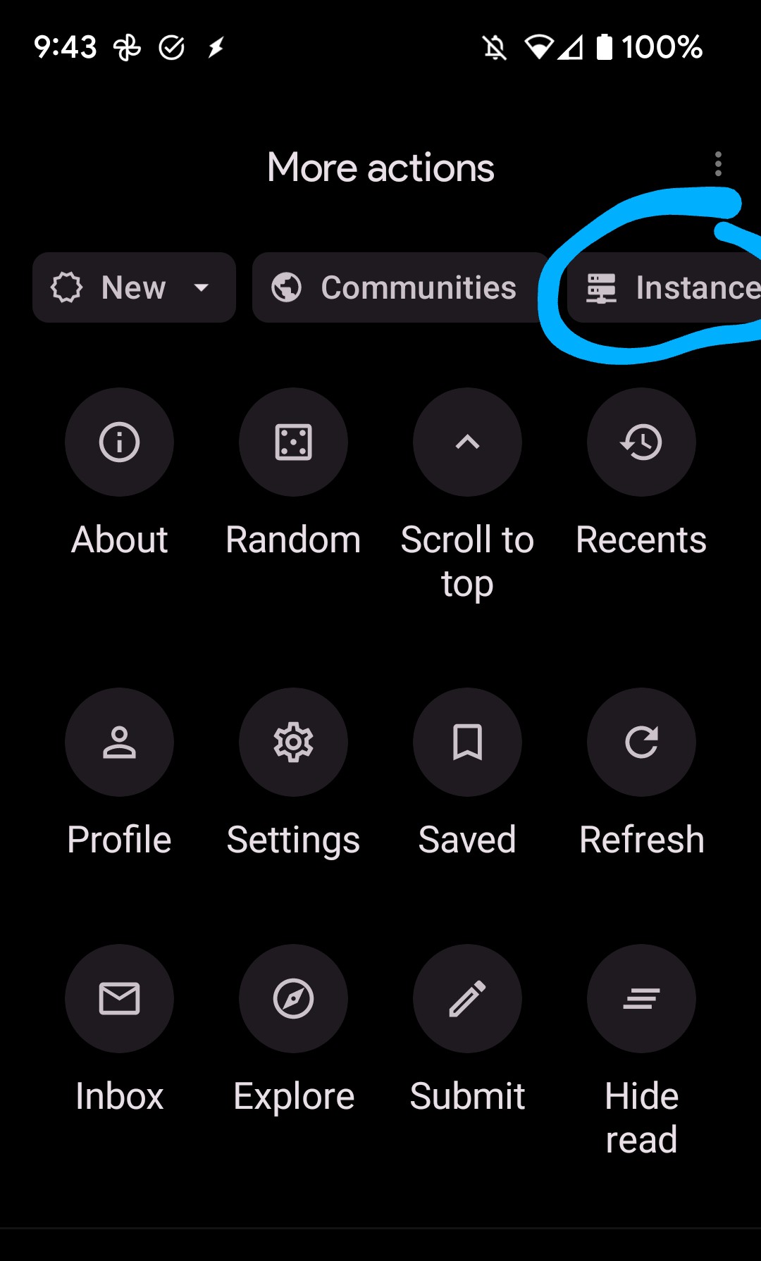
That’s fair 😁


