

Why do companies constantly feel an urge to update their logos? I see this as marketing teams needing to show they are doing something so they come up with a “project” and then convince the management it’s necessary…
Because the CEO is probably having an existential dread crisis and needs to do something about it. So he fucks up the logo because he can, and fuck you. Now watch Mozilla ads from their newly acquired Ad company.
Nobody needs marketing people.
The font doesn’t look too good
Not even Fira :/
and not Zilla Slab (which even had an opentype feature to replace “Mozilla” with “Moz://a”)
The only REAL Mozilla logo

I mean, if the intention is to reflect the utterly bad decisions Mozilla has made, this new logo would be spot on
Is that last resort of mozilla foundation. That is futile. Every new update from then enshitify firefox also if google won’t be able to pay browser owners to be default search engine, mozzila will drown without that money.
Should’ve used Papyrus
I feel like we were just getting used to the old new logo?
It’s possible this new logo is only for using next to other brands.
What other problems left to solve? Right, let’s change the logo.
Am I the only one who only sees a pitch black image?
Pretty sure it’s black on transparent. Not the most visible, especially if your client makes the background black.
I switched to light mode to take a look at it and now I can confirm it looks absolutely terrible.
Ugh. Requiring your users enable light mode to look at an image is just cruel and unusual punishment…
I took a screenshot
You, my friend, are a truly unsung hero. ❤️
Also, damn, that’s an ugly logo…
As a calligrapher, this is not pleasing to look at. Far from it.
Can confirm, it looked better as a pitch black blob.
Fuck you, Mozilla, it’s uglier and tells less about your core product, which is also the only thing you have that makes people tolerate your other stupid decisions.
Also, fuck your “a” in that font. I’d punch that fucking glyph in the face if it spoke to me on the street.
I’m right there with you. Although I might not wait for that glyph to speak 😜
The flag looks like Nepal’s flag.
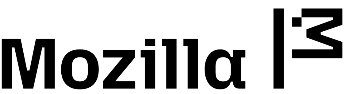
Why did they copy i3?
Coincidentaly :/ is the symbol for “a bit sad”
Also hier soll das neue eingebettet sein

Und das ist das alte

Das neue ist hässlich