
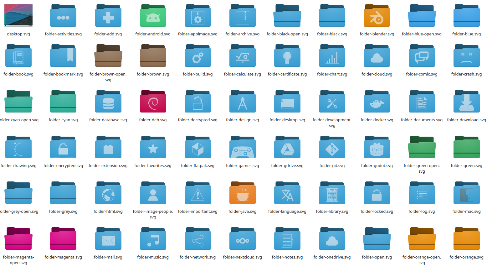
My opinion, if possible, just use the Papirus icons by default. It does such a great job of being consistent while giving apps their own look.
Seems kinda inconsistent. I’m seeing thin lines, thicc lines, flat, 3d, colored and monochrome all together
filled areas and outlined, simple and chaotic… :-)
Jesus, it’s so inconsistent. I suppose that may be beneficial when looking at all of your folders at a bird’s eye view but my knee jerk reaction isn’t the most positive.
The icons don’t all speak the same language, true. Some are way more elaborate and detailed than others, which just makes them look off.
Maybe the library could be a single book instead of an entire bookshelf, for example?
There’s another icon called “folder-book”
Ah, didn’t see that one at first. Even that icon is still too different from the others though, using thinner lines and no fill. Hm
Still garbage. Why is it so hard for the KDE guys to actually design something simple that makes sense? Starting with proportions and spacing between elements that they seem to be unaware of?
?? I specifically don’t use KDE because I cannot stand its modern design. I’m on Trinity DE because I want something more 2012. This is not 2012 at all.
default KDE*
but then I don’t understand who uses KDE and doesn’t kustomize it
Ooh, it really reminds me of newaita reborn which is one of my favorite icon themes. I’m glad they’re making it a little less minimal
…
I’ll be sticking with papirus.
Here is an alternative Piped link(s):
Piped is a privacy-respecting open-source alternative frontend to YouTube.
I’m open-source; check me out at GitHub.
Loving the new style. Still a bit of rough edges to polish and can’t wait to see them in practice after the finall release in February next year.
I’m not the most knowledgeable on this subject, but I’m curious to learn more.
Why do various toolkits have major releases that seem to reset the features of the last one?
GTK 3 seems like GTK 2 but slower to me, and before the transition was even complete GTK 4 showed up, which just seems like GTK 3 but a bit different. Qt 5 works really well and is efficient on resources, so why are we switching to Qt 6? It seems like reinventing the desktop over and over again.
I understand updates for the kernel for compatibility, small to medium updates to all software for bug fixes and new features, and major updates to toolkits when there are big problems with the current release (X vs Wayland for example). Or if the current release was unreliable and bloated, which I heard was what happened with Qt 4 and why they switched to 5. But I also heard Qt 3 was really stable and lightweight, so why did they switch away from it?
Gtk 3->4 made a lot of internal changes, and at least some were related to making wayland work. Wayland “worked” in gtk3, however it was very much an afterthought, and half the toolkit was useless under wayland. Other changes are usually required for changes related to rendering, gtk4 had vulcan rendering which may require some breaking changes. Another thing is just general breaking changes that are good, sometimes you realise some decision was bad, and a new major release is just a way to make these.
From the end users perspective nothing much changes, it maybe looks a bit different, but not much besides that. But a vulcan renderer and being fully wayland compatible are major improvements that also improve the user experience, even if you don’t notice directly.
Interesting. I’m guessing the changes were too big to just be added incrementally in updates to GTK 3?
Usually the problem isn’t that the changes are big, but that the new way simply isn’t compatible with the old way to do things, and you can’t just make a change that will break existing applications in minor versions (well, there’s nothing technically stopping you, and unintentional compatibility breaking bugs have definitely happened in the past, but people are gonna get real mad at you if you do that). Even if you break that change up into thousand tiny changes over many minor versions, the end result is that at some point, you break old apps.
The solution is to take note of all the things that are either badly designed or became obsolete and once in a while go “hey, let’s make a new major version and fix all of this crap”. With a new major version, you don’t have to worry about old applications and are free to improve your library in any way you wish, and you also get the option to keep updating the old major version with some maintenance bugfixes so that the old apps keep working well enough.
The unfortunate consequence of this is that old working apps need compatibility updates.
Usually there’s big new features that accomodate more modern hardware better. As an example, Qt6 revamps support for Wayland, HDR, and scaling. Even these things on their own don’t seem like much, but if you go back to KDE 5 in 10 years time you’ll definitely feel like something is plain/dated (or completely not working if you’re on new hardware)
Thank you for the explanation! What specifically does Qt 6 do that Qt 5 can’t do?
They are not quite aweful, but thank the tao Plasma is customizable and you can set your own icon set.
Now KDE needs to implement a consistent design language for its apps, clean up its settings, and have better defaults. Not asking KDE to copy Gnome, just that it needs a lot more work to be palletable to someone using it for the first time.
TODO since KDE 3…
This is soooo good
Kinda hard to tell with the symbols due to the white on light blue
Why is everything a folder? What does a debian or android folder do?
Look forward to Plasma 6 where everything will be an application. Downloads folder? That’s an application now. A font you just installed? Application. The video you just downloaded? You guessed it
It’s deb, not Debian, so I’d assume it’s the icon for .deb files (which are browsable archives).
Debían no idea… But I guess android could be android studio folders or similar stuff?
Looks like mountain lion
Finally designers are realizing it’s not 2013 anymore and nobody liked the Win8 designed-in-powerpoint style.
yuck


